As follow-up to my surprisingly popular post on my homemade electrodes, ERPOLOGY asked to see the EEG traces. Well, since making graphs is one of my most favorite things to do (NERD ALERT!), I’m happy to oblige.
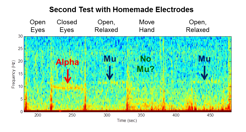
- Closed Eyes (to see Alpha Waves)
- Open Eyes and Relaxed (to see Mu Waves)
- Open Eyes While Moving Hand (to suppress my Mu Waves)
Time-Domain Plots
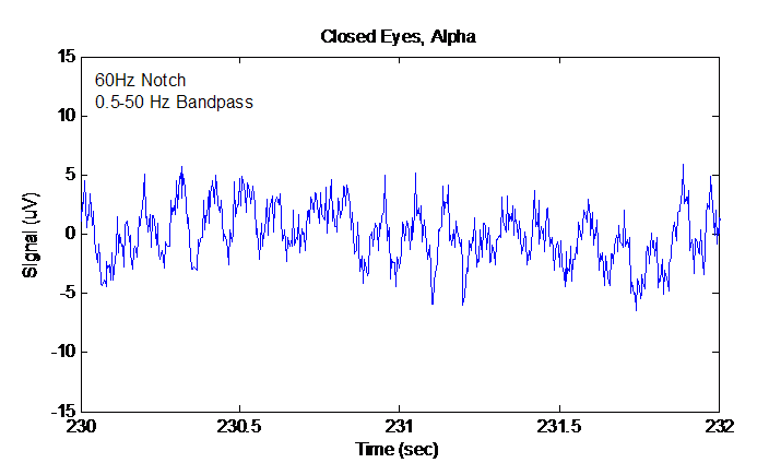
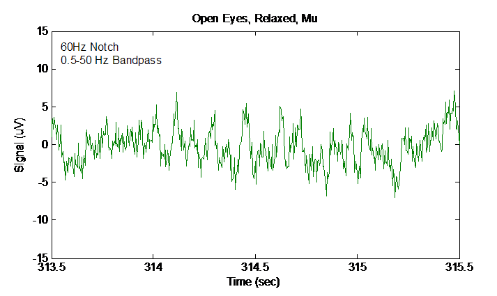


As you can see, the Alpha waves were definitely at a lower frequency (9.3-9.8 Hz using my data reading cursor) than my Mu waves (11.7 Hz). As I mentioned during the discussion of the time-domain plots, the spectrogram showed this fairly well. But, a basic spectrum plot like this one makes it much easier to see and quantify the difference between the two.
Also, this graph implies that the Mu waves were about half the amplitude of the Alpha waves. While it is true that Alpha are clearer in the spectrogram, which suggests that the Alpha were stronger, the primary reason that the Alpha were clearer is because I was able to sustain the Alpha waves more steadily than the Mu waves. Detailed examination of the data shows that my Mu waves came and went every few seconds. Therefore, in the averaged FFT plot, the apparent amplitude of the Mu waves will appear to be smaller simply because it includes all those short periods where the Mu waves temporarily went away. That’s a risk with using a heavily-averaged spectrum plot. You gotta know your tool.
Finally, this spectrum plot nicely shows how clenching my hand (the red trace) suppresses the Mu waves completely. Again, that was clear in the spectrogram, but this plot shows it very nicely as well.
Implications
With this extra detailed view of the data, you can start to see how you could design a signal processing chain to detect Mu waves. Looking at the frequency plot, it is clear that you would need a really tight filter…maybe about 1 Hz wide. For me, the filter would need to be centered on 11.7 Hz. You might have your own special frequency. Finally, because this plot shows that the energy in my PDR Alpha overlap with my Mu, you might want to sense the frequencies on either side of your Mu waves. If there is energy on either side of Mu, then it’s likely that the energy inside your Mu frequency band is from something else…such as PDR Alpha.
Without a graph like this, designing the signal processing would be much harder. With this graph, I get all sorts of ideas. This is why I like graphs so much…they can give quick insight into complex data.
If you’ve made it this far…thanks for reading! You’re awesome!
Follow-Up: Want to see my data from this experiment? Check out my github!